about the project
the app sim - ideas for marriage is a startup based on a mobile product to help brazillian brides on the preparation of their weddings, since the selections of references and inspirations to the contact with services and professionals they need to hire.
the app sim - ideas for marriage is a startup based on a mobile product to help brazillian brides on the preparation of their weddings, since the selections of references and inspirations to the contact with services and professionals they need to hire.
for many, planning a wedding, with all kinds of different details to focus on can be a really big challenge, not mentioning the budget size and high expectations involved on the way. plus, the field is still mostly based on personal contacts, face to face negotiation and familiar business, that can be old fashioned, to say the list. in other words, a digital transformation of the field was urging.
within this context, i was contacted by an entrepreneur of the field to build a product that could create a market place and fill this gap of a digital approach to the problems of finding and hiring the supply chain for weddings and parties.
although the idea by itself was not new, with a considerable number of similar players, most of them were based on the united states and europe, and, during the research, it was found that the few ones operating in brazil had a weak mobile presence, at the time that the use of smartphones and apps were flourishing rapidly in brazil.
the solution
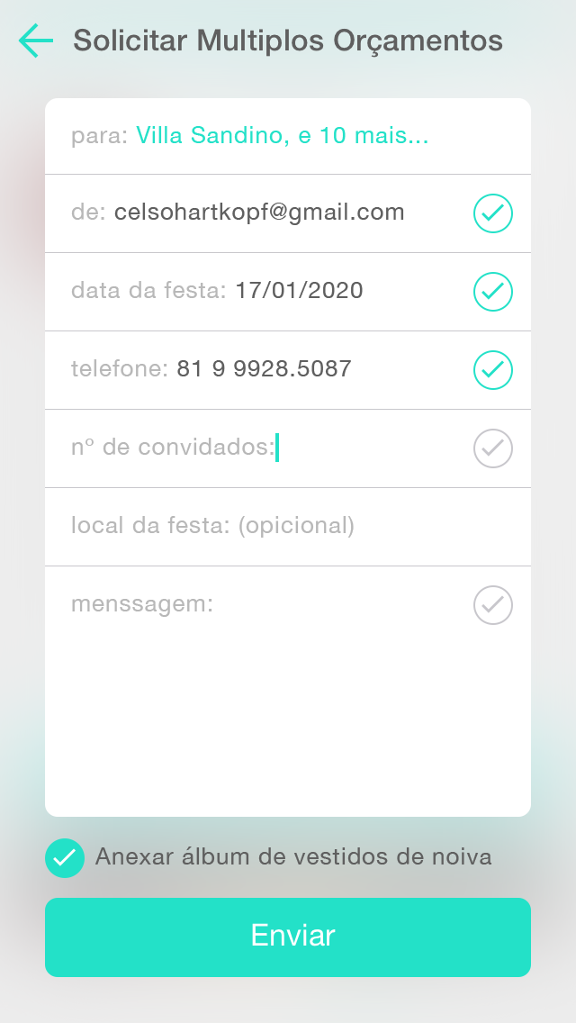
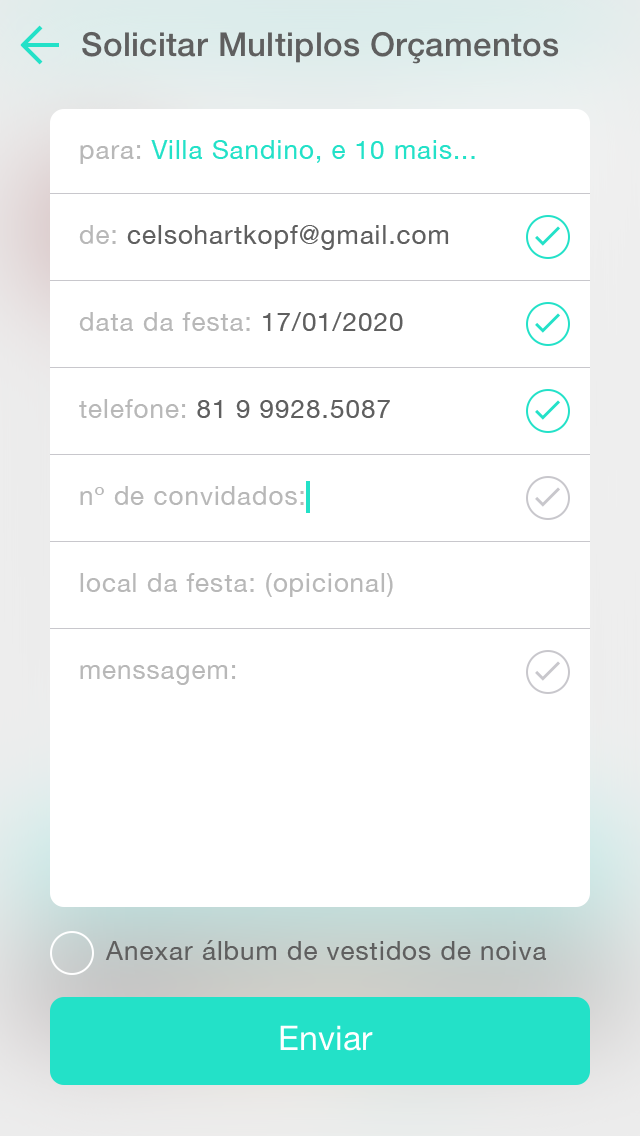
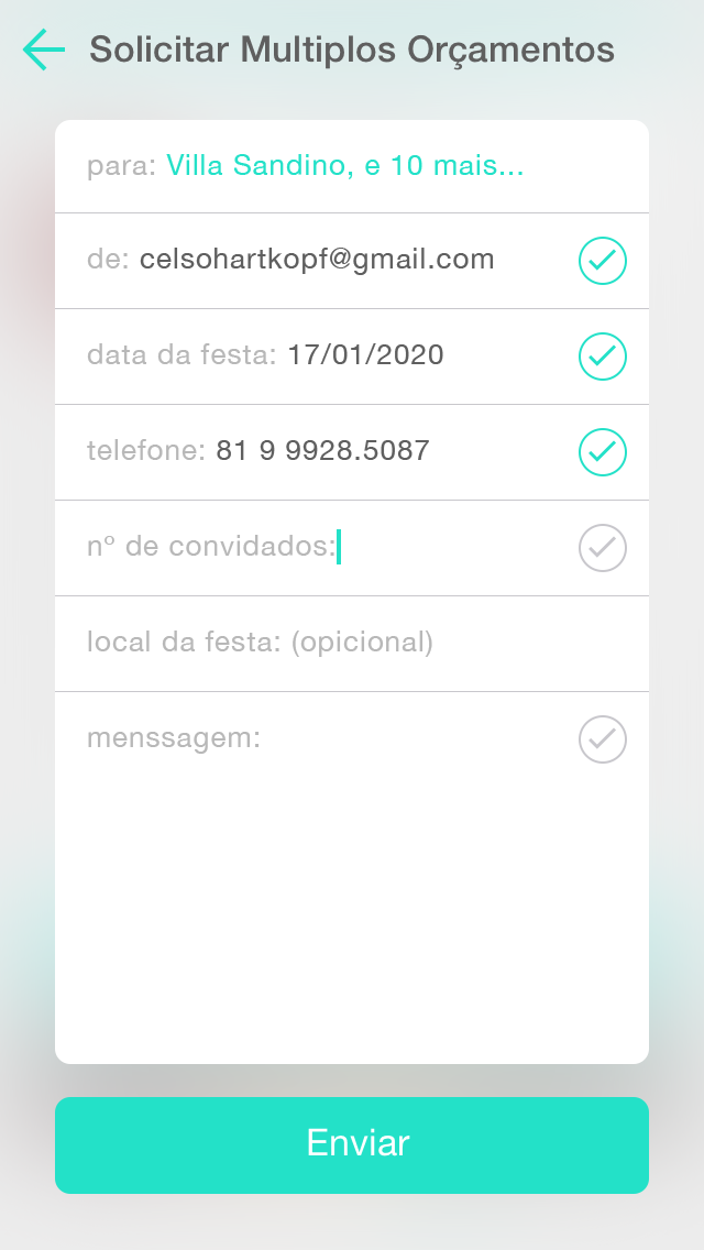
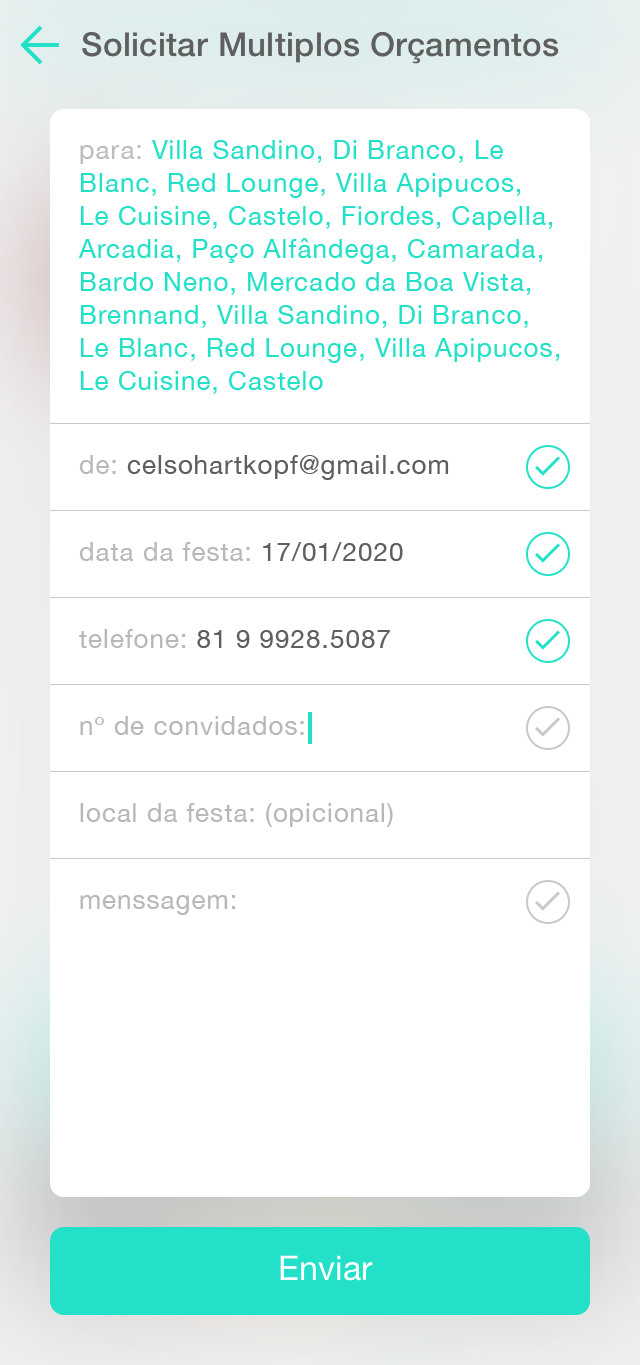
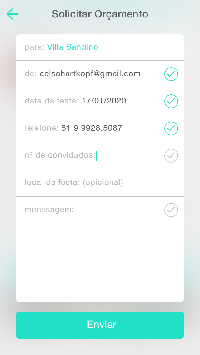
during the research it was found two main problems that causes pain to the majority of the target audience that we were looking for: first, decide what they want for every little detail of the wedding, and this is not simple at all, since the experience of dealing with 10 to 20 different suppliers, from dress, makeup, buffet, decoration, photography, film, music, and so on, can be exhausting. the second major problem was to find the right professional for then, taking in consideration the local they were from, the styles and services preferences, the fees and schedule of the event.
during the research it was found two main problems that causes pain to the majority of the target audience that we were looking for: first, decide what they want for every little detail of the wedding, and this is not simple at all, since the experience of dealing with 10 to 20 different suppliers, from dress, makeup, buffet, decoration, photography, film, music, and so on, can be exhausting. the second major problem was to find the right professional for then, taking in consideration the local they were from, the styles and services preferences, the fees and schedule of the event.
our product team realizes that a digital product that retains the users for the life span of the problem, in average a year, should deliver a solution for both of these challenges. and so, me as lead designer, the sponsor, a senior developer and a junior designer, teamed up and designed a product to solve those problems.
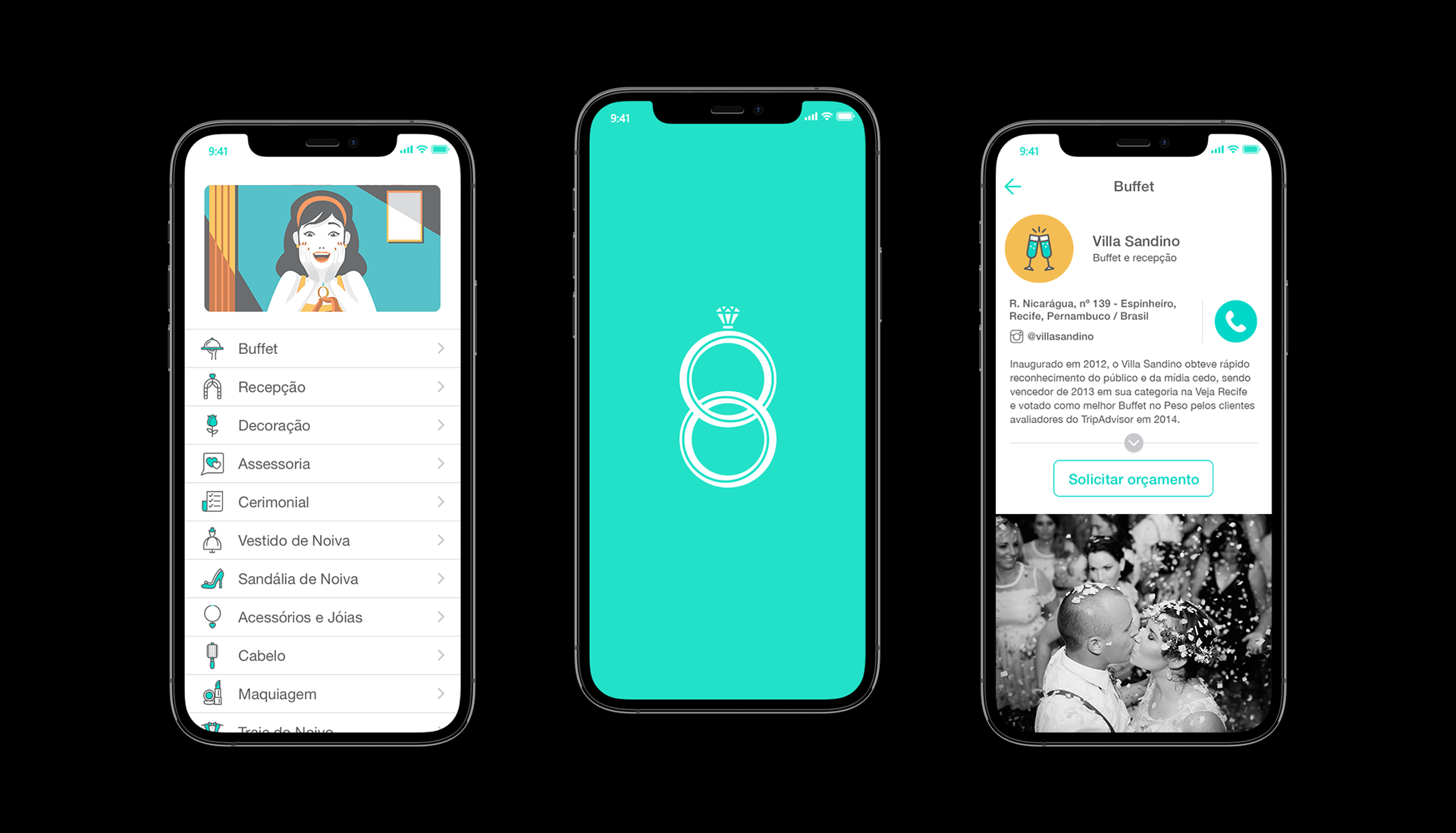
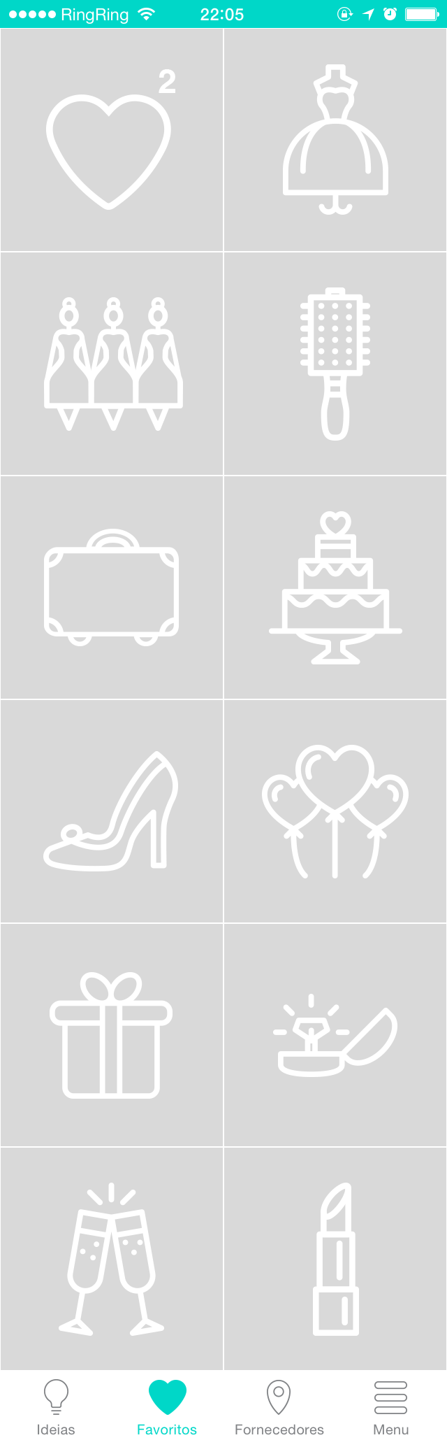
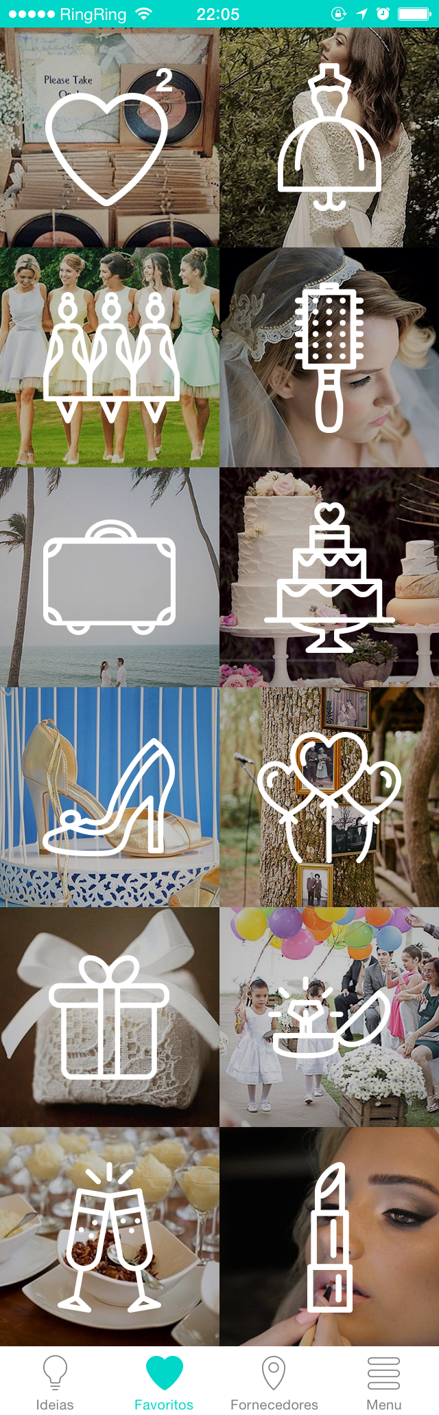
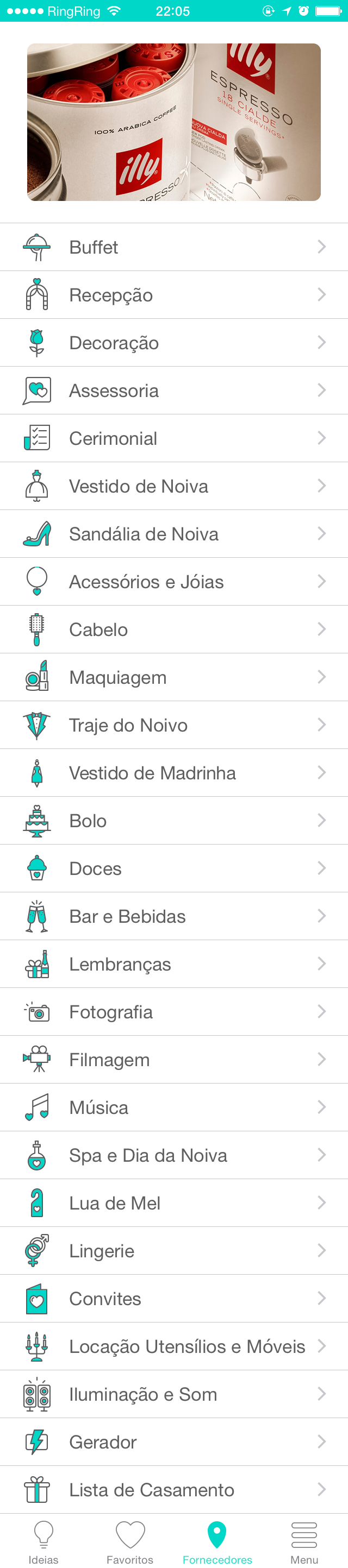
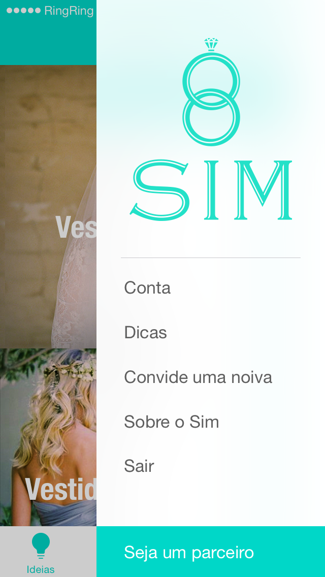
as a result wee came up with a app, with native versions for iOS and Android, with four main sections:
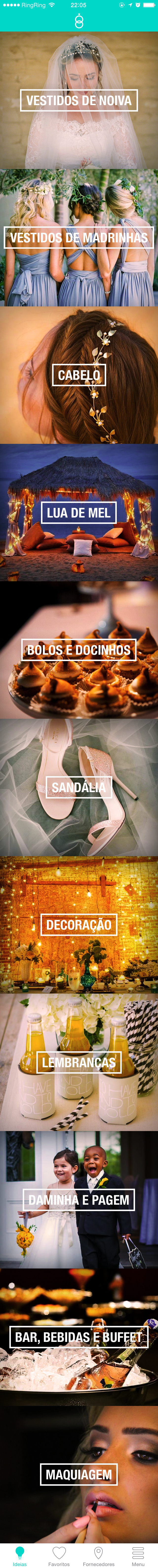
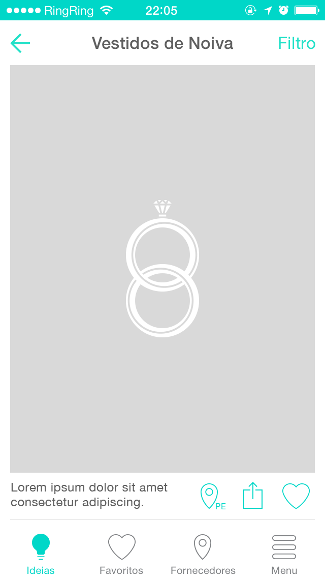
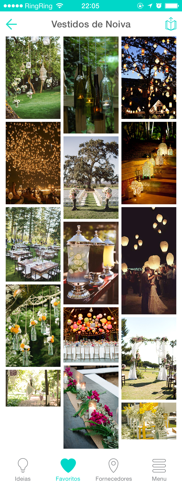
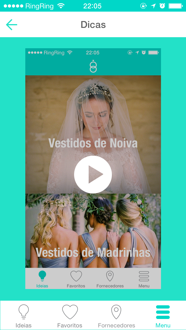
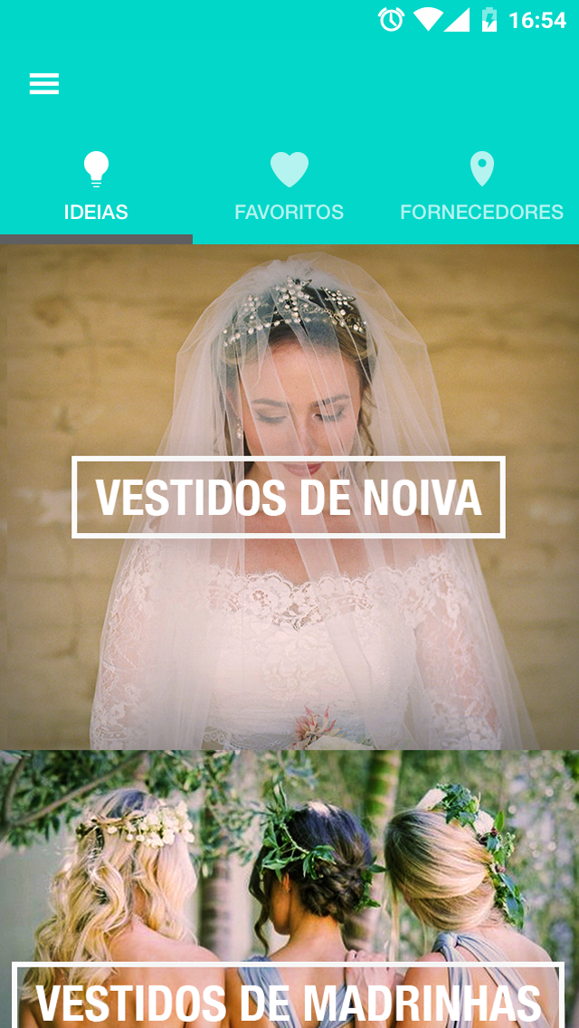
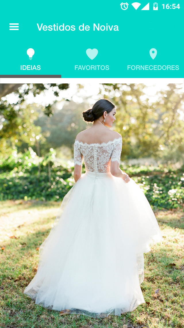
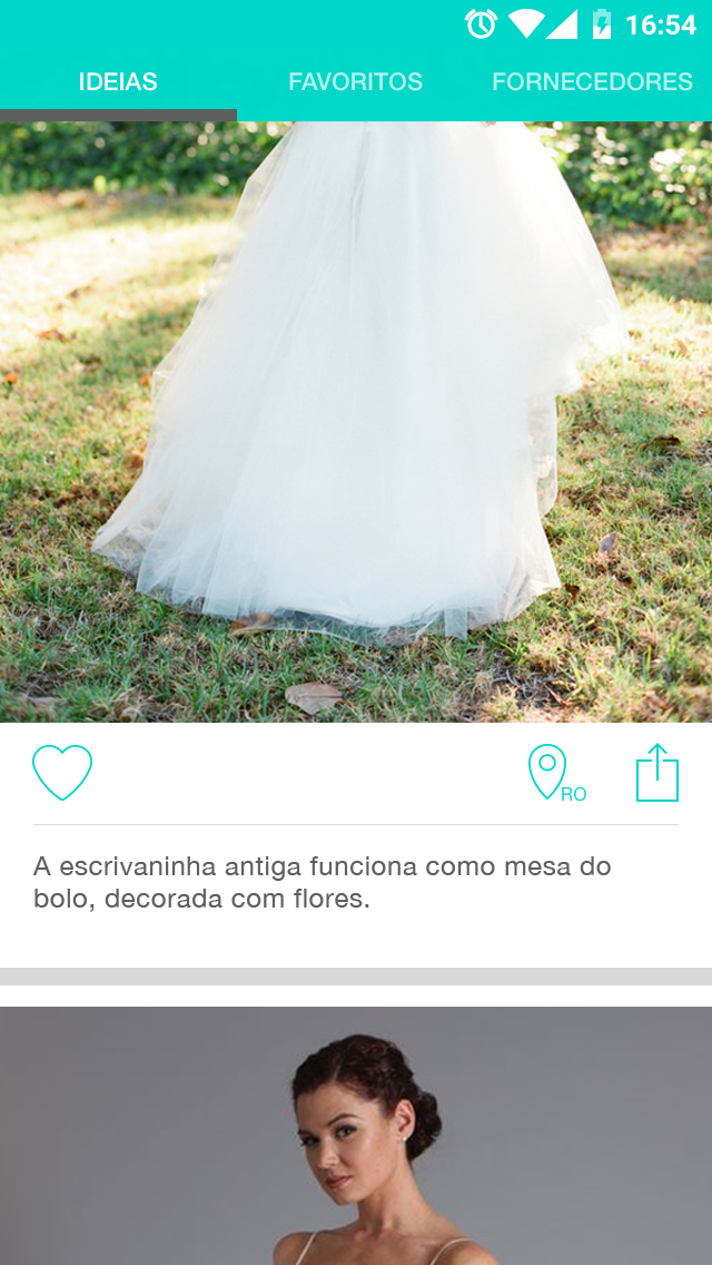
1. a inspiration feed, categorized by the main topics, such as dress, decoration, hair, etc.
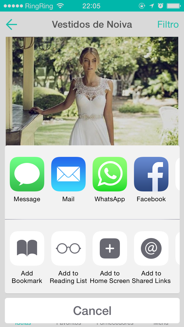
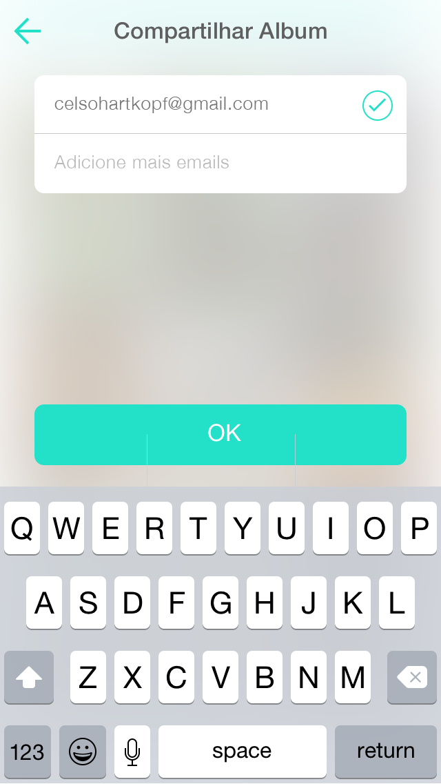
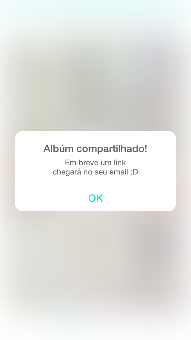
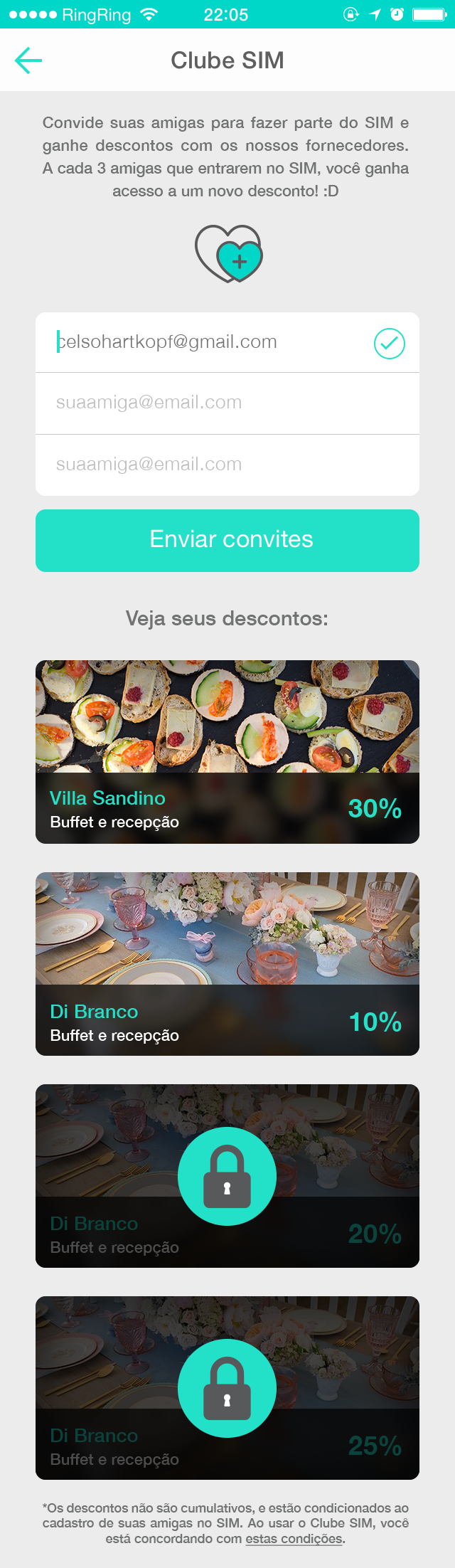
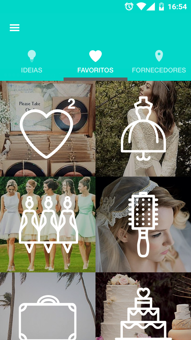
2. a favorite album, that the user can save the imagens and share with the professionals they hired.
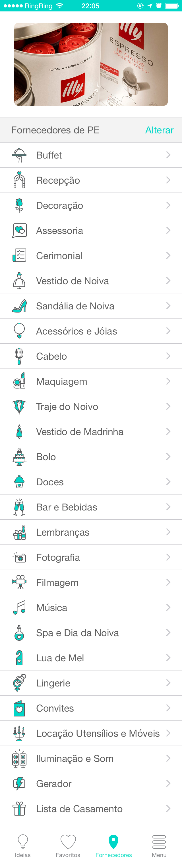
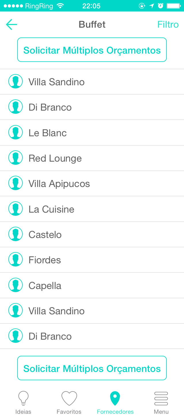
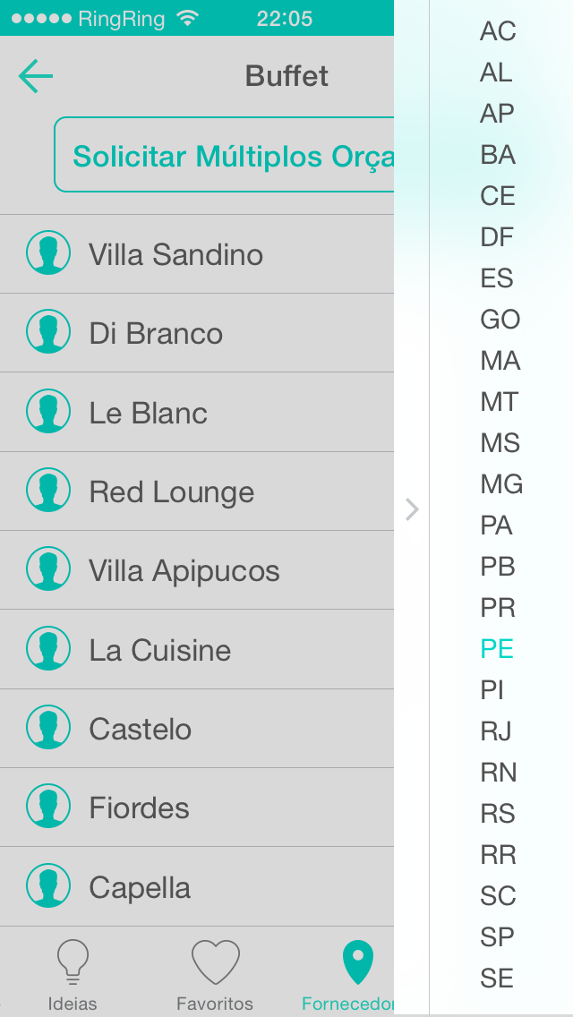
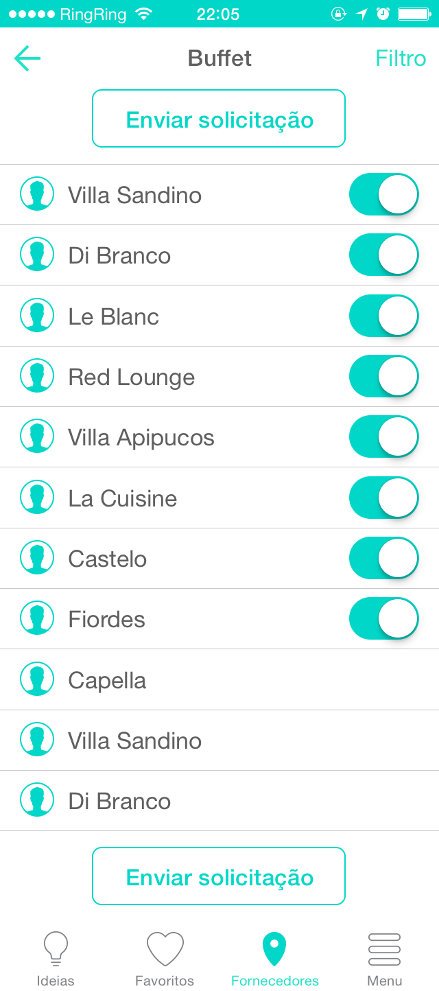
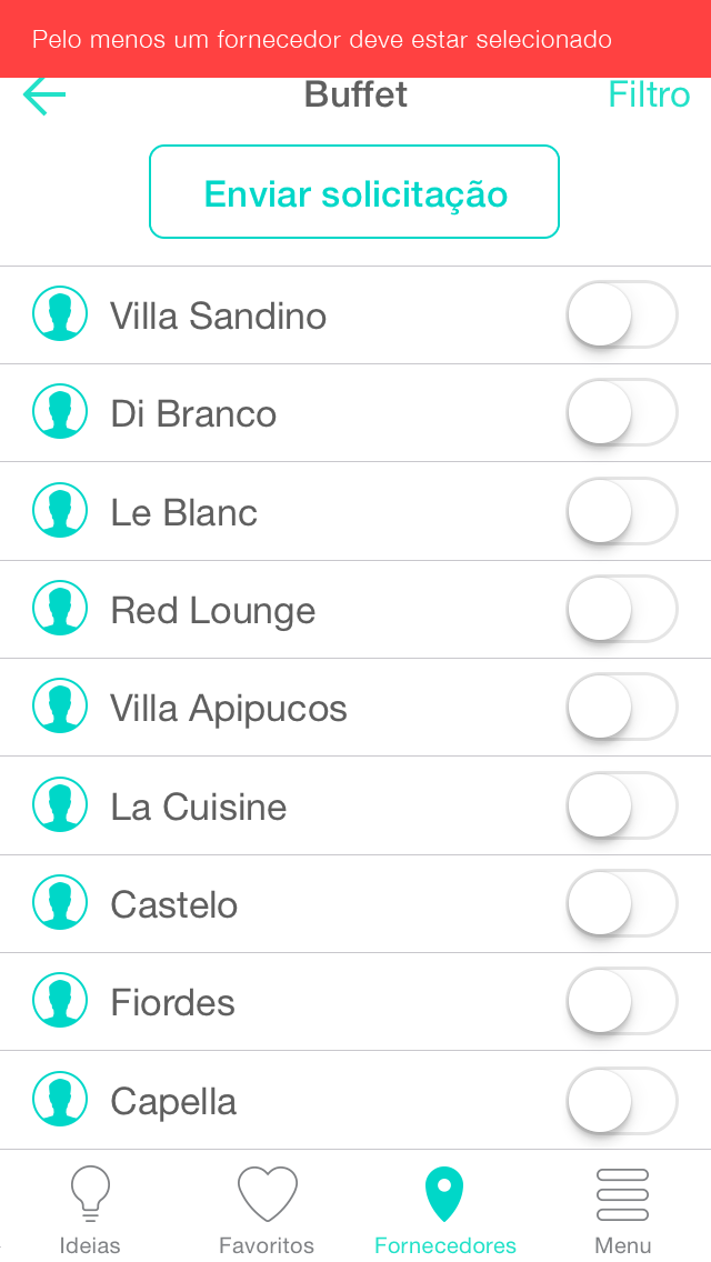
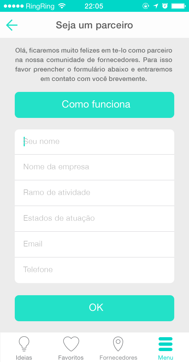
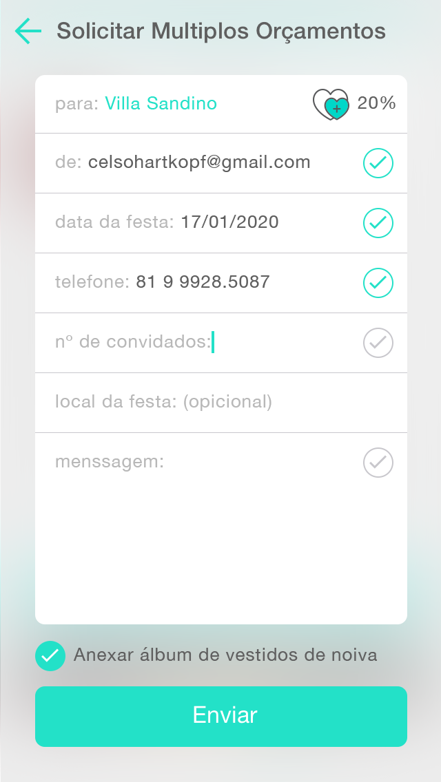
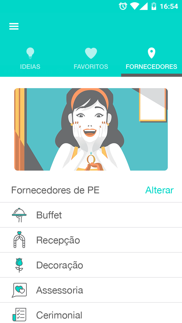
3. a guide with companies e professionals, categorized by city and type of services they provide.
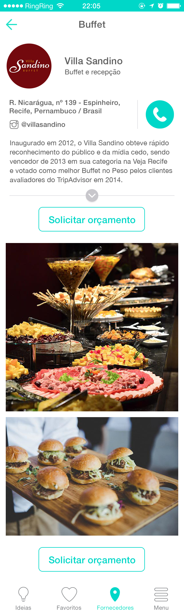
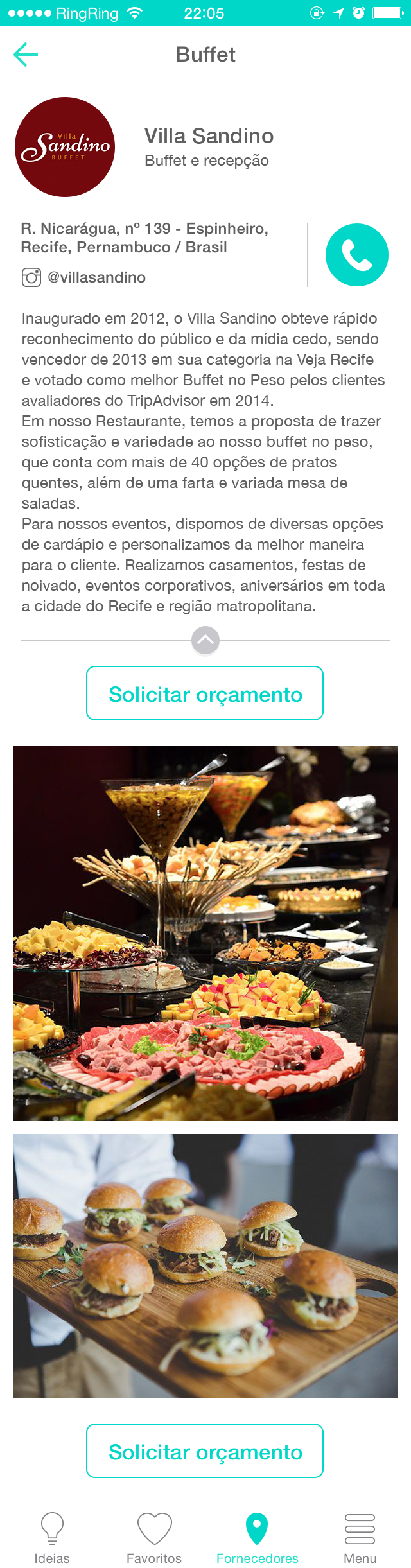
4. a profile page for professionals, with images and a direct contact by mail.
1. a inspiration feed, categorized by the main topics, such as dress, decoration, hair, etc.
2. a favorite album, that the user can save the imagens and share with the professionals they hired.
3. a guide with companies e professionals, categorized by city and type of services they provide.
4. a profile page for professionals, with images and a direct contact by mail.
my roles
lead product designer
ux and ui designer for ios and android versions
brand strategist and designer
designer of the web and sales funnel channels
art director and producer of the videos adds
*all the strategic definitions of the product, roadmap, launch and marketing decisions were made by the principal team
*all the design artefacts shown on this page were made by me
tools and services used
adobe Suite (xd, photoshop, illustrator, premiere)
marvelapp
mail chimp
adwords
wix
mysql
adobe Suite (xd, photoshop, illustrator, premiere)
marvelapp
mail chimp
adwords
wix
mysql
team
principal
1 sponsor
1 lead designer (me)
1 senior backend developer
1 junior designer
outsourced
2 frontend ios developers
1 frontend android developer
2 animators
principal
1 sponsor
1 lead designer (me)
1 senior backend developer
1 junior designer
outsourced
2 frontend ios developers
1 frontend android developer
2 animators
recognitions
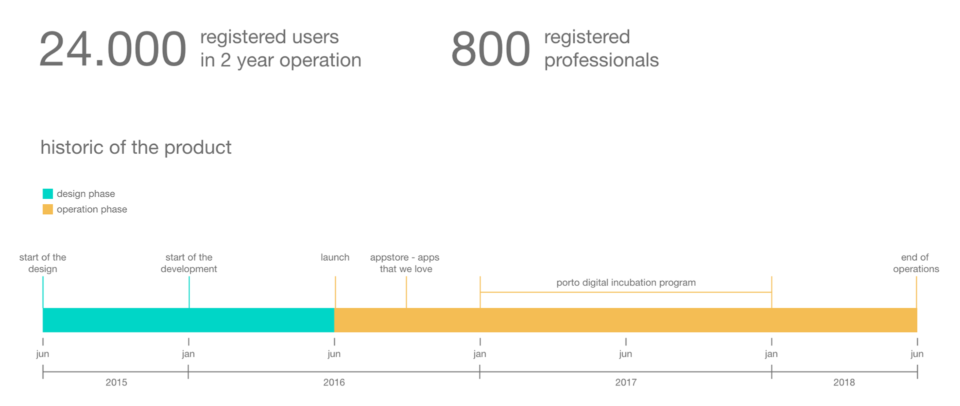
apple appstore - new apps that we love (2016)
incubation in the porto digital program (2017)
apple appstore - new apps that we love (2016)
incubation in the porto digital program (2017)
definition of product requirements and wireframing
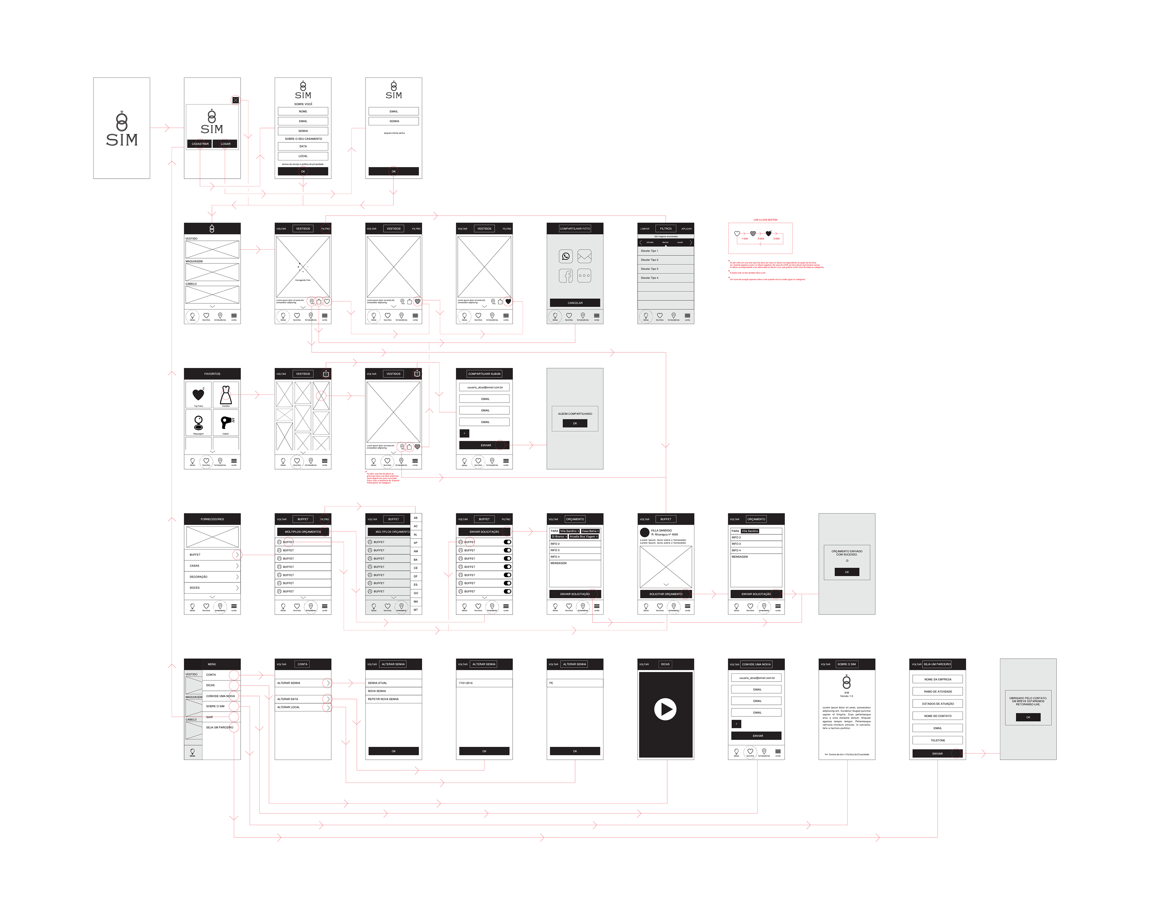
the problem finding research was previously made by the sponsor through interviews with target users and key stakeholders of the business. once we agreed upon the outcome we needed to deliver for our target users and understood the journey they should go through when using a digital product for that goal, i started to materializa those ideias into mobile users flows. first, on paper, along with the principal team and, when we get to the main flows, i draw a final wireframe. this artefact was used all through the development phase, by us and by the outsourced developers as the main guide of the application.
the problem finding research was previously made by the sponsor through interviews with target users and key stakeholders of the business. once we agreed upon the outcome we needed to deliver for our target users and understood the journey they should go through when using a digital product for that goal, i started to materializa those ideias into mobile users flows. first, on paper, along with the principal team and, when we get to the main flows, i draw a final wireframe. this artefact was used all through the development phase, by us and by the outsourced developers as the main guide of the application.
brand and visual fundaments
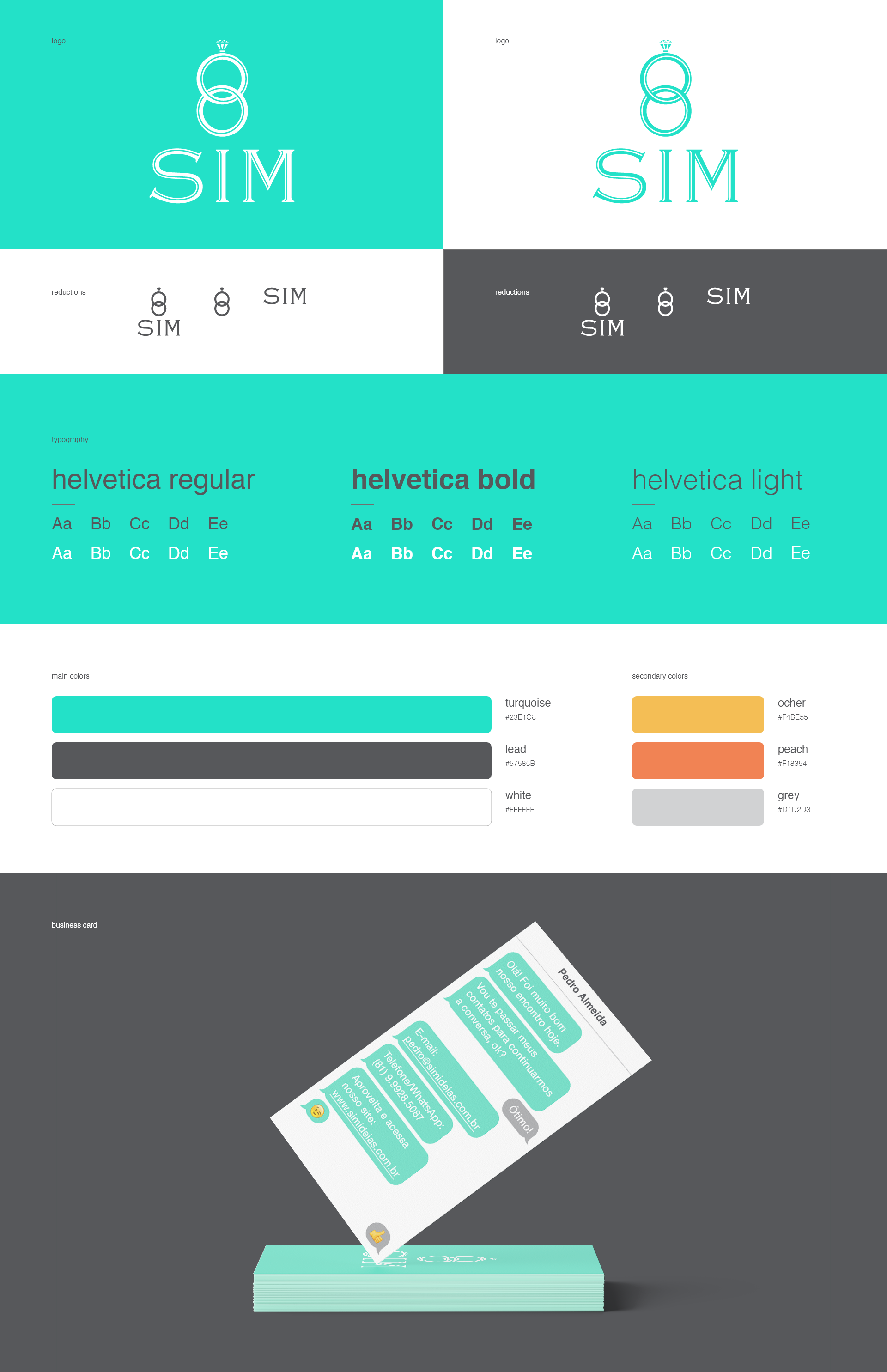
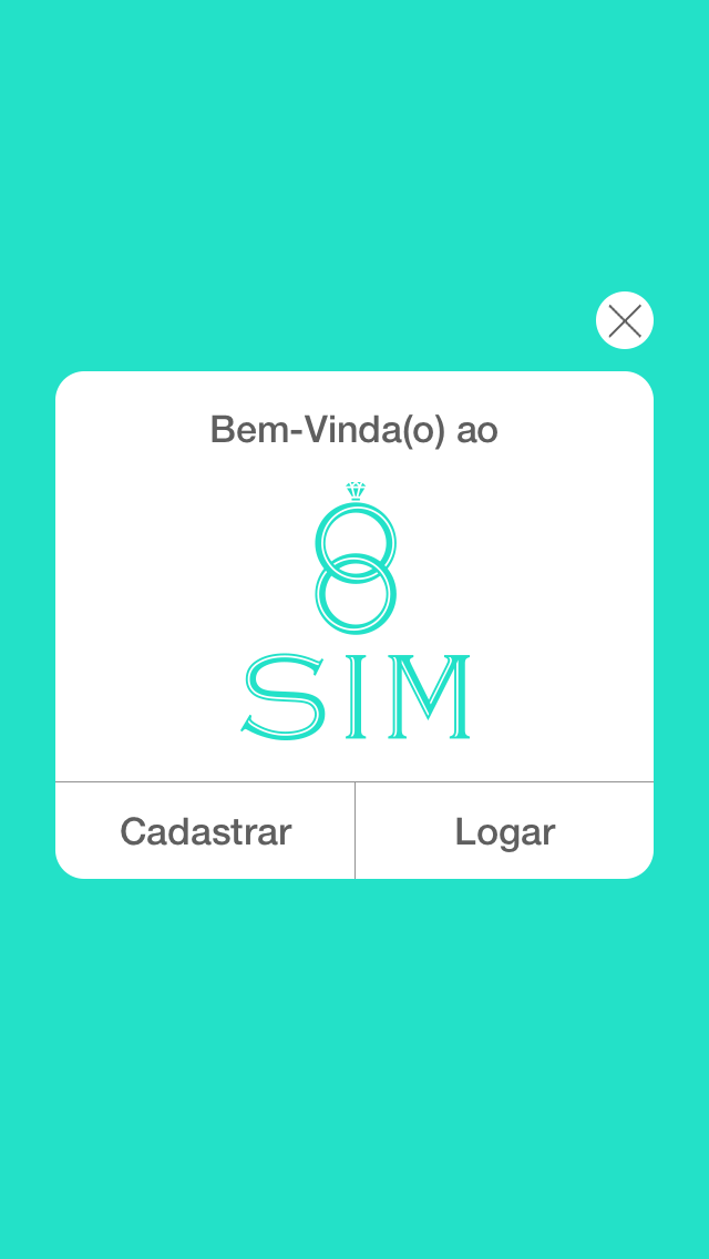
the visual fundamentals for the product followed a soft and clean design approach. the symmetric logo had responsive variations to be used across small screens easily. the font used across all the product touch points has helvetica, in the versions regular, bold and light. and for the colors, the turquoise, lead and white were the principal color used on the product and, when a color variation was needed, three secondary colors could be used in the layouts and visuals.
the visual fundamentals for the product followed a soft and clean design approach. the symmetric logo had responsive variations to be used across small screens easily. the font used across all the product touch points has helvetica, in the versions regular, bold and light. and for the colors, the turquoise, lead and white were the principal color used on the product and, when a color variation was needed, three secondary colors could be used in the layouts and visuals.
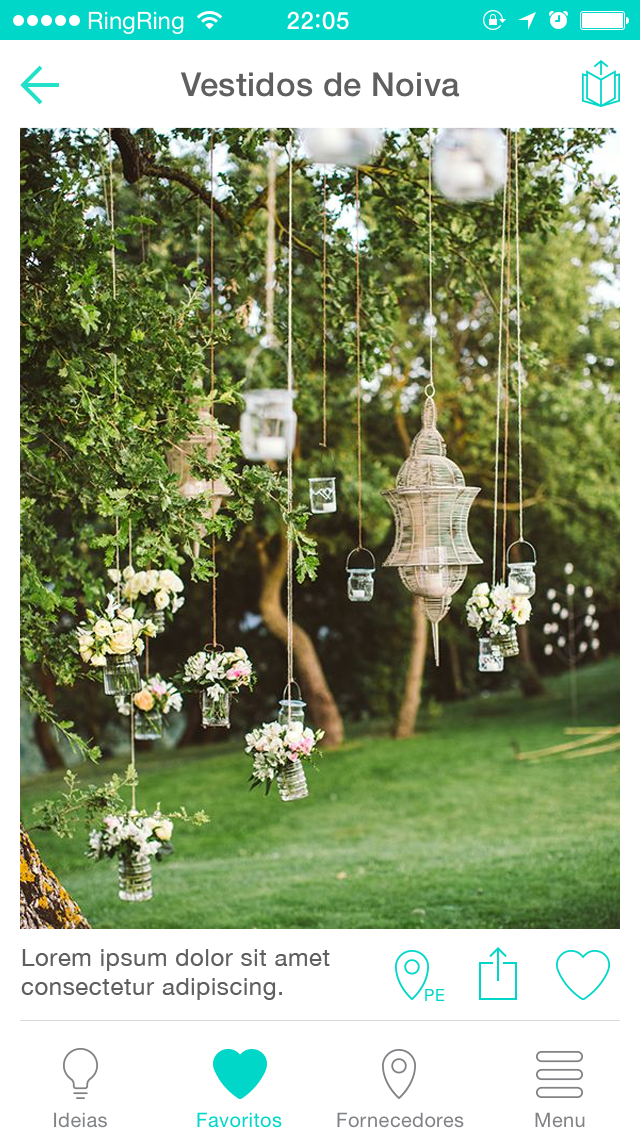
interface design
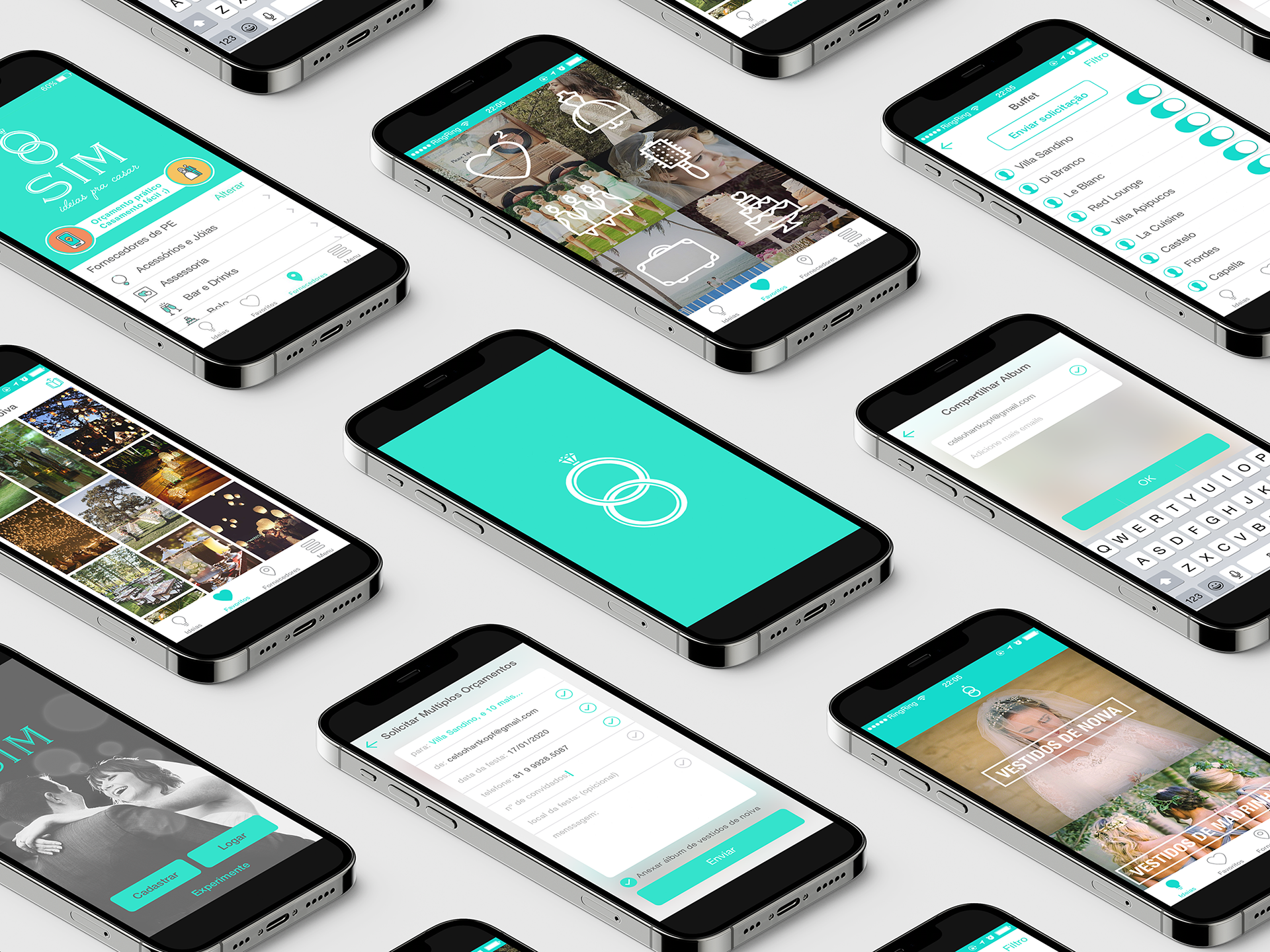
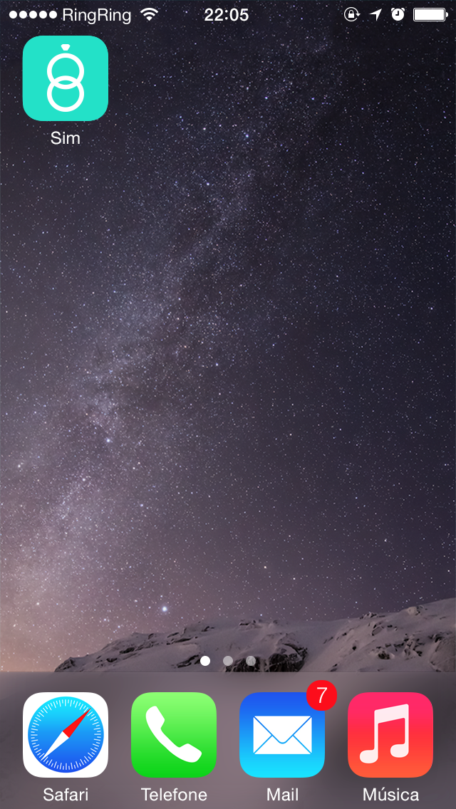
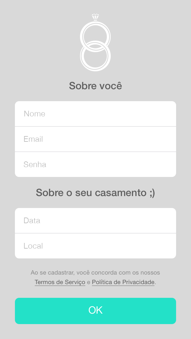
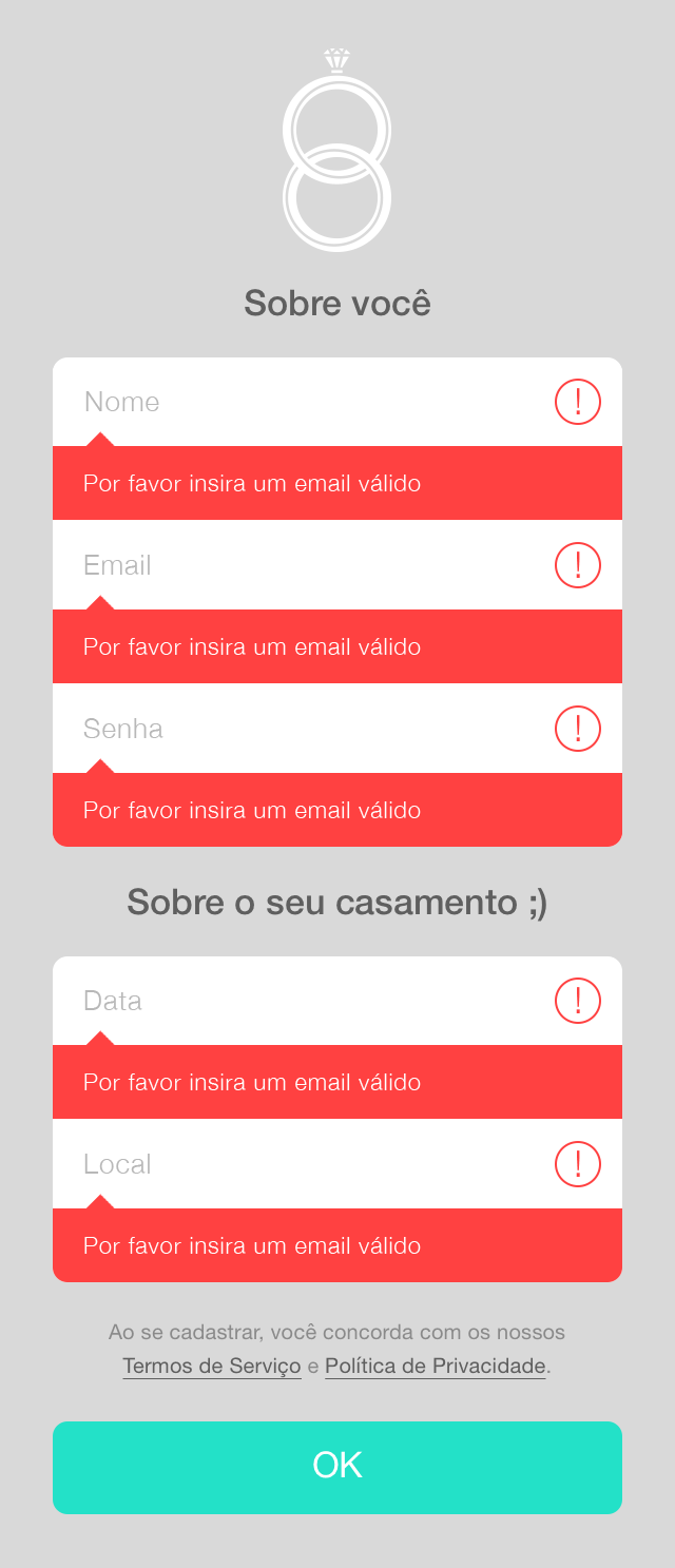
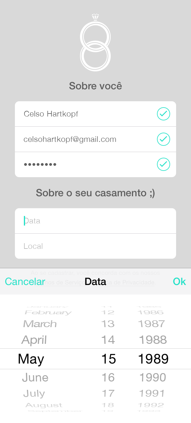
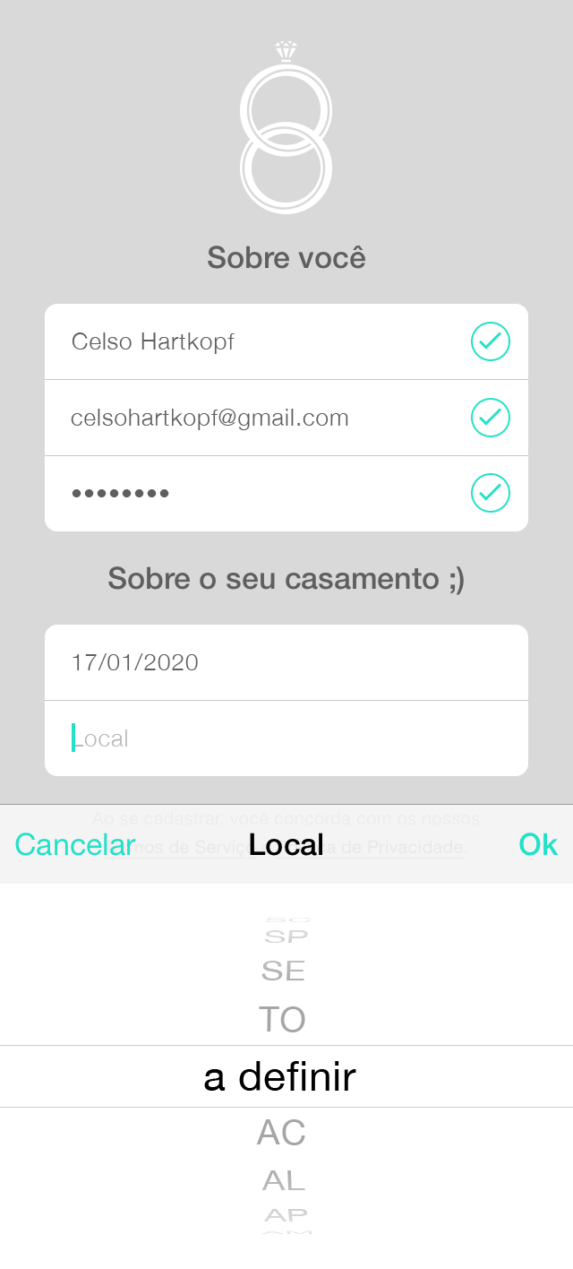
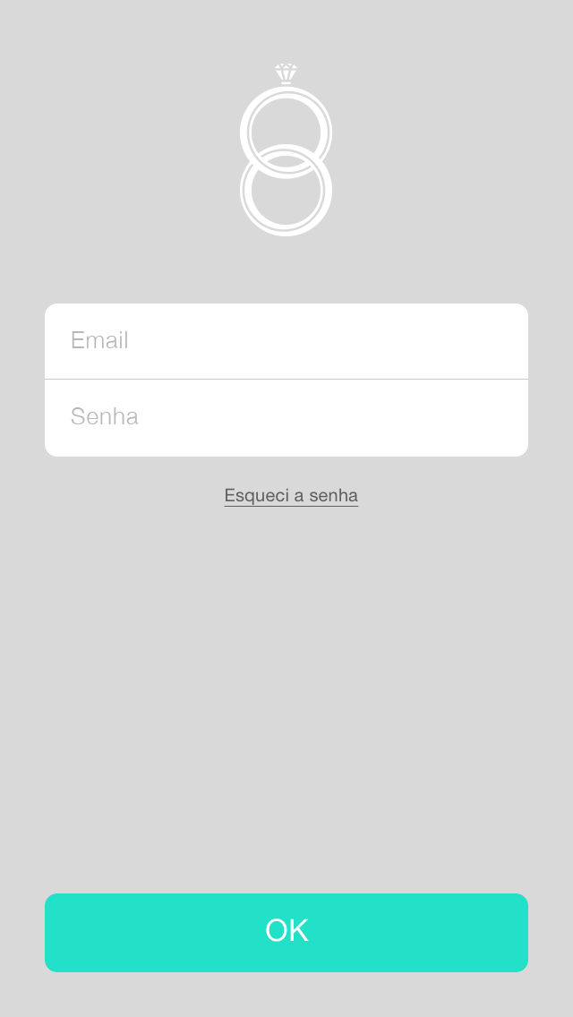
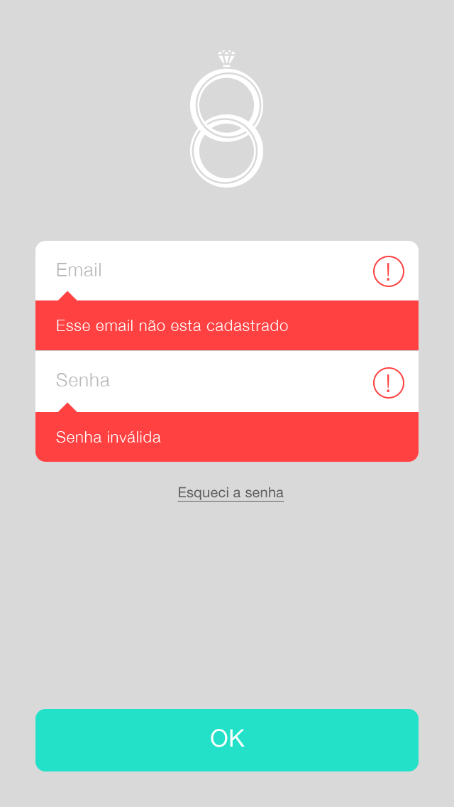
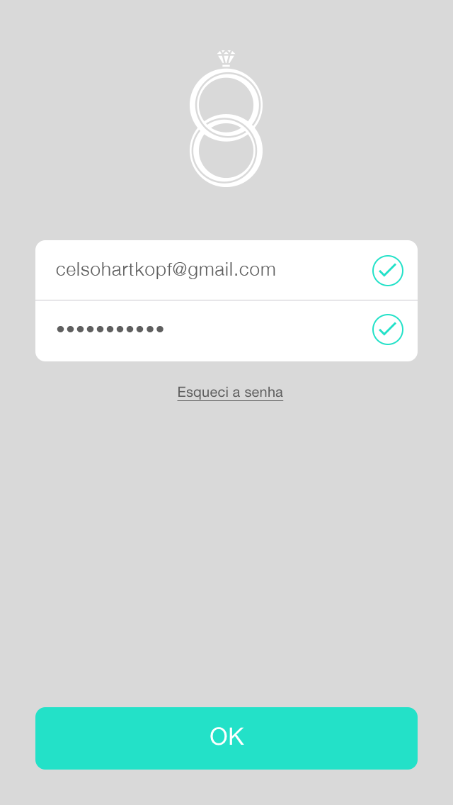
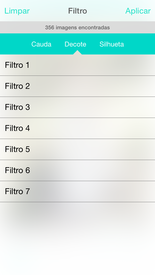
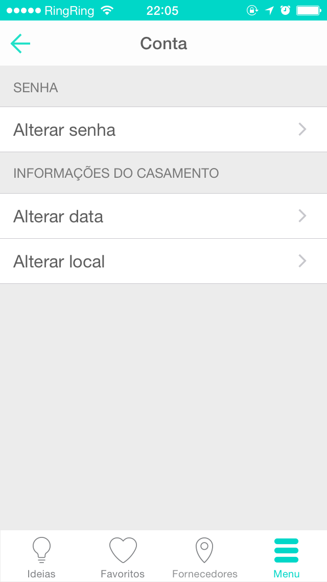
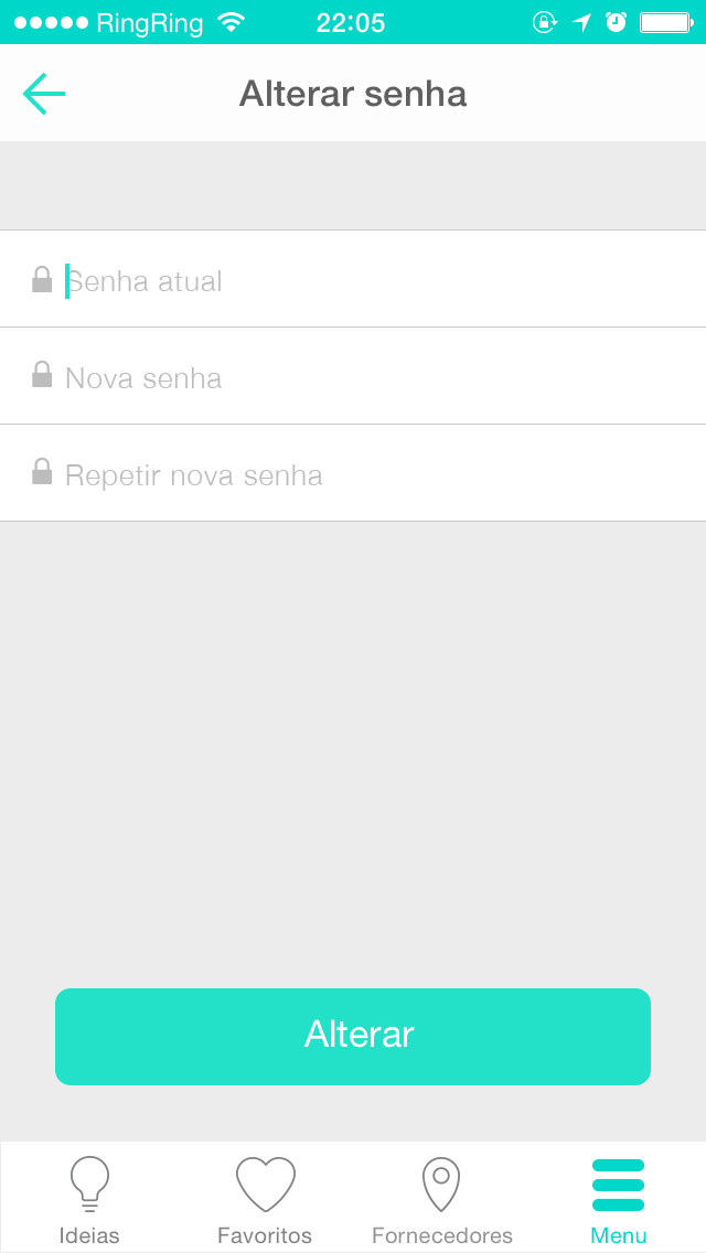
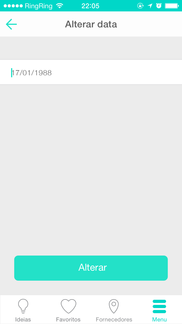
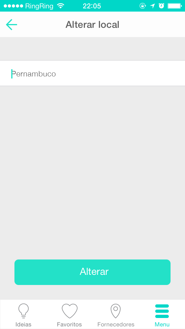
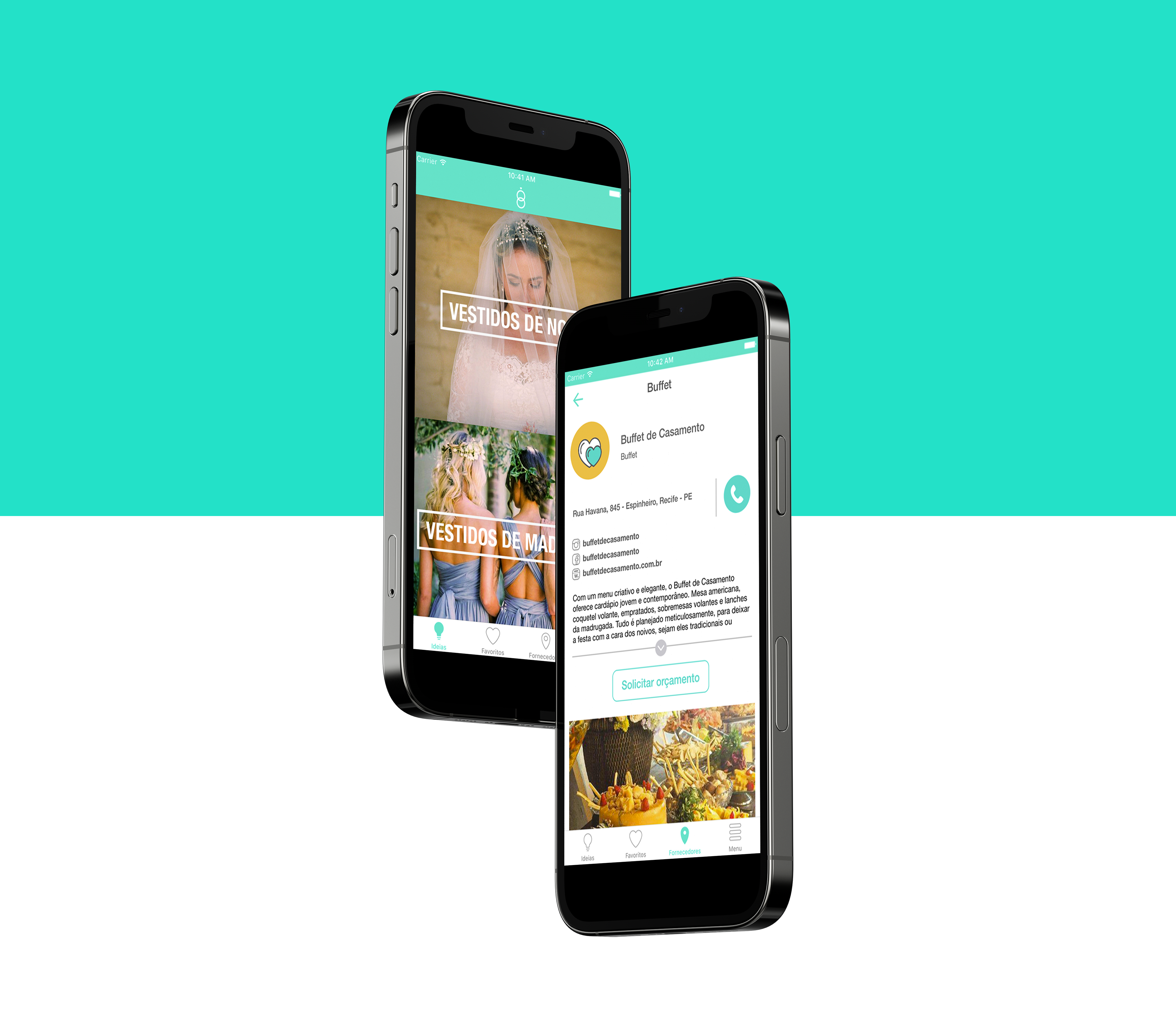
in the interface design phase the ios system was chosen to be the first target to be designed, based on the type of users we aimed for our acquisition. the ui design focused on delivering a fluid navigation, as simple and clear as possible, balanced with the visual trends of the year for ios, such as transparency and background blur. as the app was mainly based on photos, those were chosen to be the visual catch of the application, as the icons, buttons, fonts, menus and so on, made use of open source and native components, as the design efforts were directed to the intuitive and fluid user experience of the product.
in the interface design phase the ios system was chosen to be the first target to be designed, based on the type of users we aimed for our acquisition. the ui design focused on delivering a fluid navigation, as simple and clear as possible, balanced with the visual trends of the year for ios, such as transparency and background blur. as the app was mainly based on photos, those were chosen to be the visual catch of the application, as the icons, buttons, fonts, menus and so on, made use of open source and native components, as the design efforts were directed to the intuitive and fluid user experience of the product.


high fidelity prototype
once the ui designs were finished, a high fidelity prototype of the product was made. this artefact was useful for user testing, development guide and, primarily, for presentations for key stakeholders, as part of the launch strategy and business plan.
once the ui designs were finished, a high fidelity prototype of the product was made. this artefact was useful for user testing, development guide and, primarily, for presentations for key stakeholders, as part of the launch strategy and business plan.
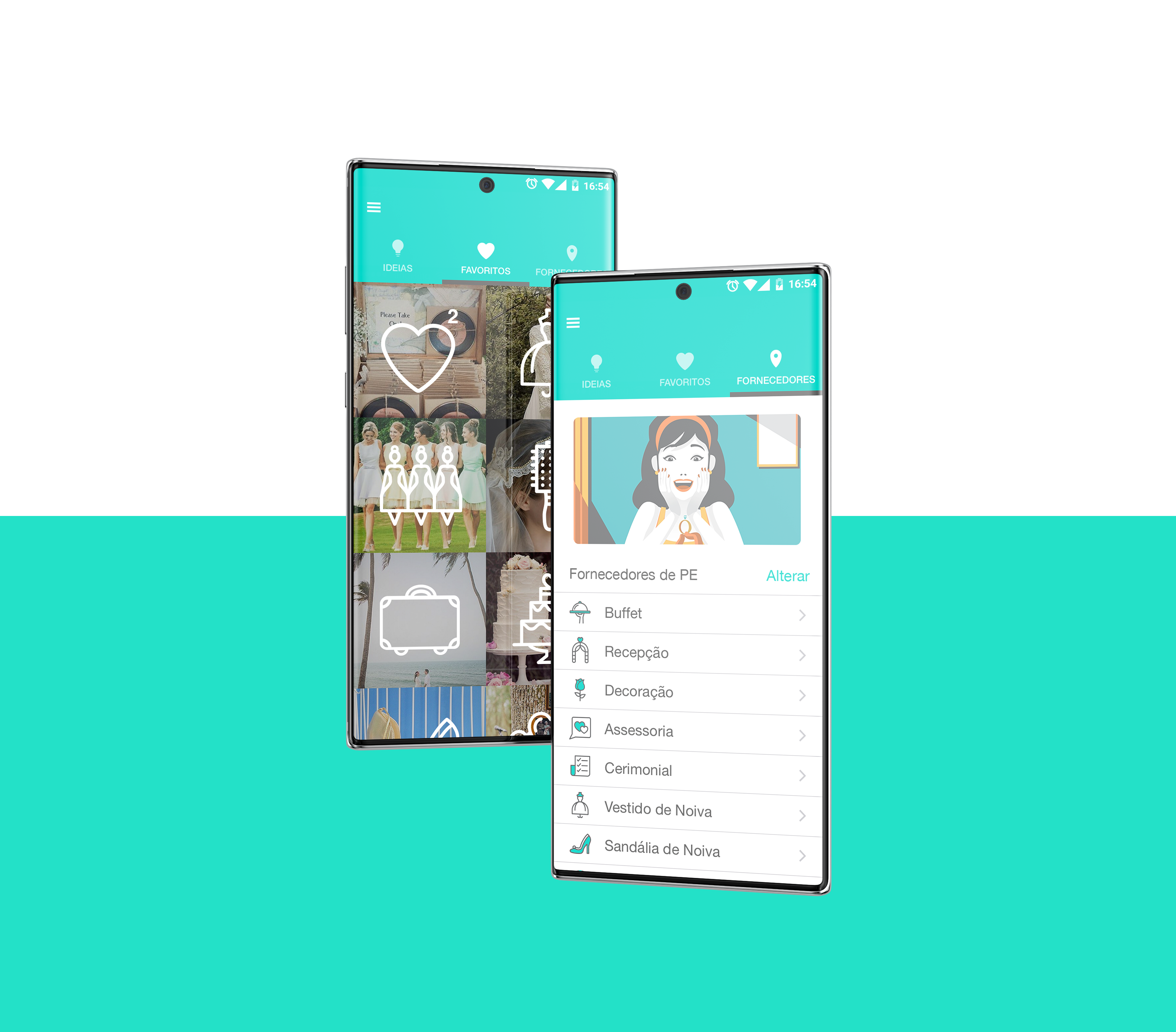
adaptation and optimization for android version
for the android version several optimizations were made, both to deliver a product with the right fit to the system users, aesthetically and functionally, as to be able to use the native android components as much as possible in the development phase.
for the android version several optimizations were made, both to deliver a product with the right fit to the system users, aesthetically and functionally, as to be able to use the native android components as much as possible in the development phase.
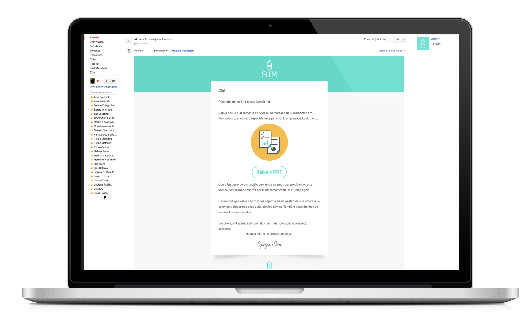
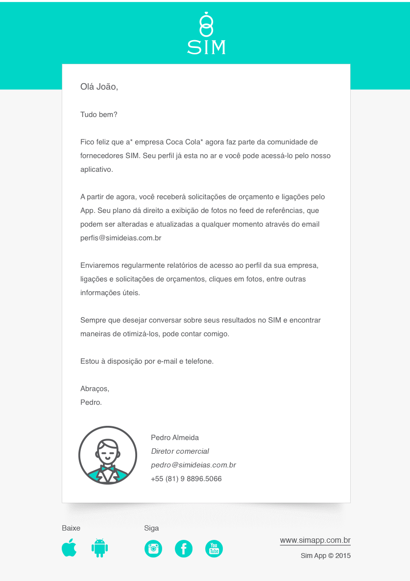
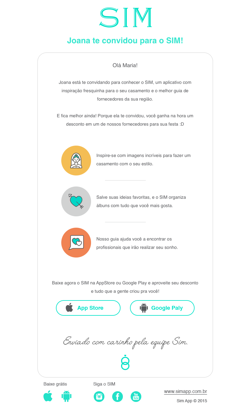
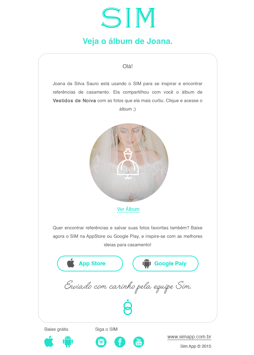
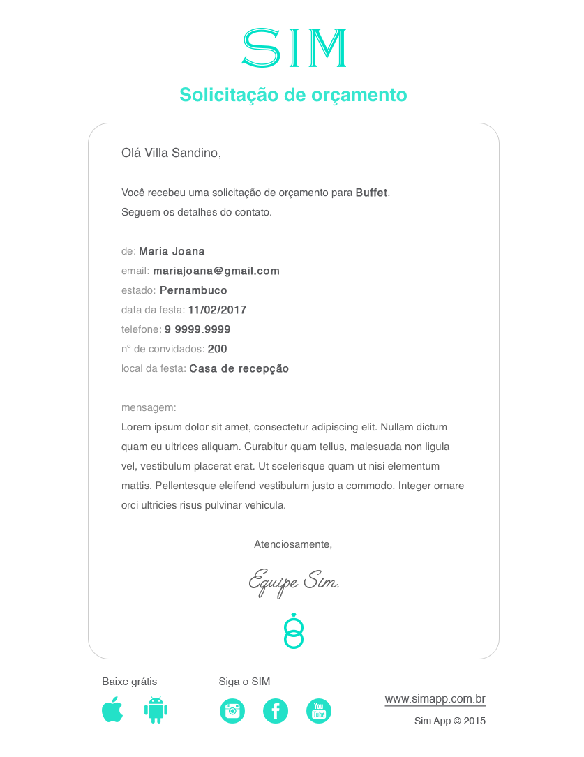
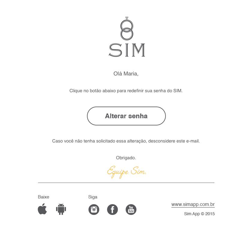
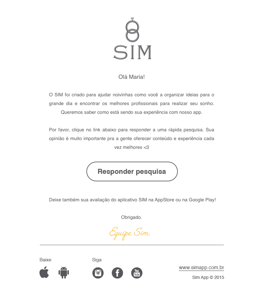
transactional e-mails
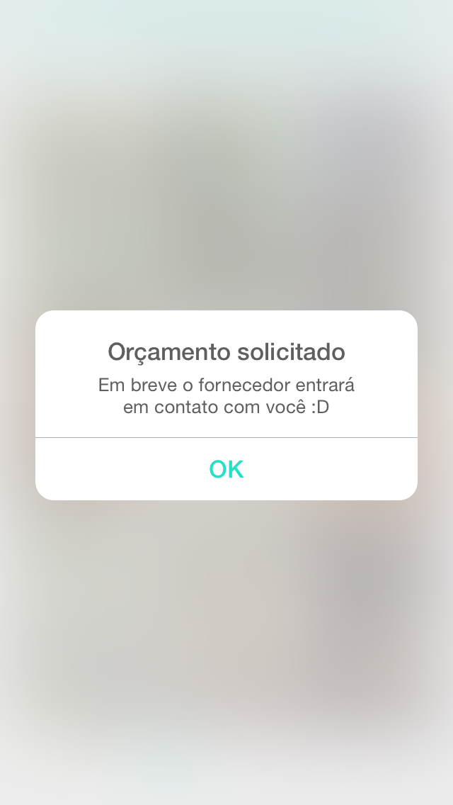
since the mail communication was a big part of the product outcome, delivering the budget solicitations, album share and sales funnel strategies, the design of those massagens was taken as an important brand and marketing ambassador of the product.
since the mail communication was a big part of the product outcome, delivering the budget solicitations, album share and sales funnel strategies, the design of those massagens was taken as an important brand and marketing ambassador of the product.
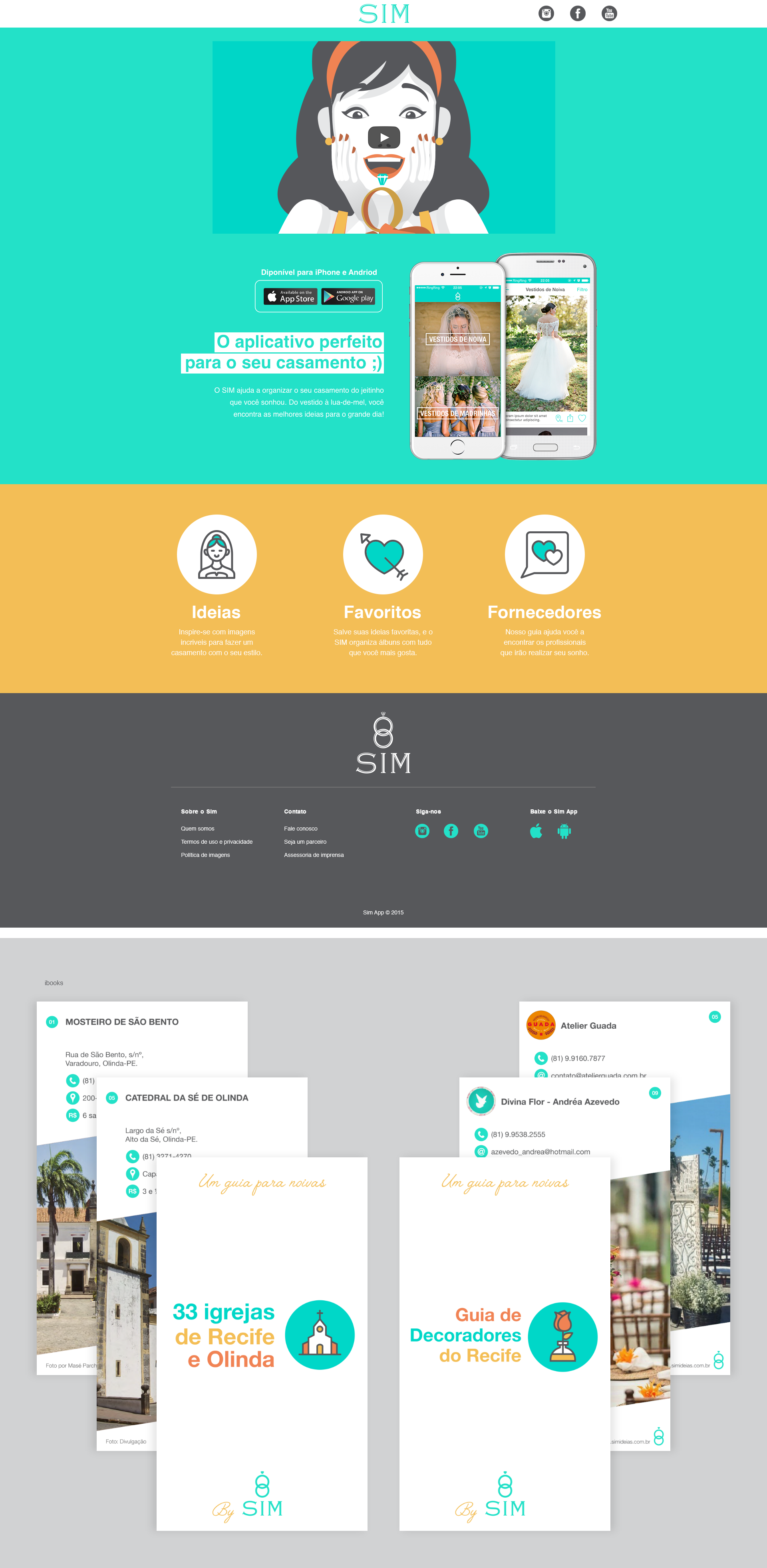
website and inbound strategy
even with the mobile being the main product we delivered, a web presence was needed especially for marketing and sales funnel strategies. along with the web site, two e-books were made as a part of the launch strategy of the product, gathering a mail list of the audience in the few months before our operation started.
even with the mobile being the main product we delivered, a web presence was needed especially for marketing and sales funnel strategies. along with the web site, two e-books were made as a part of the launch strategy of the product, gathering a mail list of the audience in the few months before our operation started.
promotional videos
as part of the launch strategy we produced an animated video, presenting the problems and solutions the product delivered, to be distributed in social media. the video was used mostly on youtube, facebook, instagram and application stores ads. during the second year of operations, UX videos were made as a promotional strategy as well, presenting the intuitive user interface as one of the mainly attributes of the product.
as part of the launch strategy we produced an animated video, presenting the problems and solutions the product delivered, to be distributed in social media. the video was used mostly on youtube, facebook, instagram and application stores ads. during the second year of operations, UX videos were made as a promotional strategy as well, presenting the intuitive user interface as one of the mainly attributes of the product.
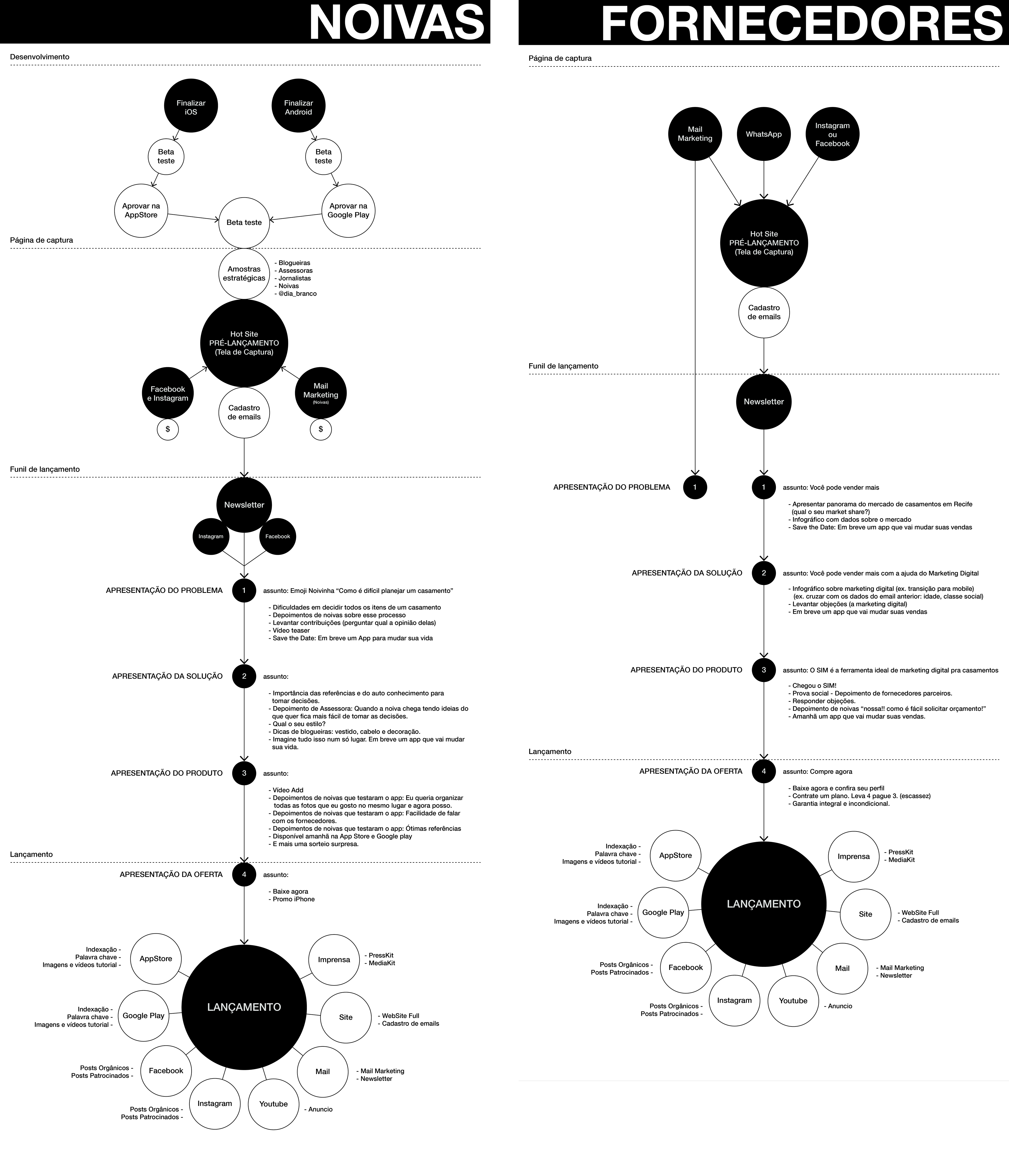
launch strategy
the launch strategy of the product had two goals: getting users as well as professional partners. at the pre-launch, two sales funnels were made: the first one, target for users, 2 e-books were created and distributed for free; for the partners, we sent a direct mail presenting the product and offering a trial period of the premium features. as the product becomes available at appstore and google play, the video ads become the main form of user acquisition.
the launch strategy of the product had two goals: getting users as well as professional partners. at the pre-launch, two sales funnels were made: the first one, target for users, 2 e-books were created and distributed for free; for the partners, we sent a direct mail presenting the product and offering a trial period of the premium features. as the product becomes available at appstore and google play, the video ads become the main form of user acquisition.
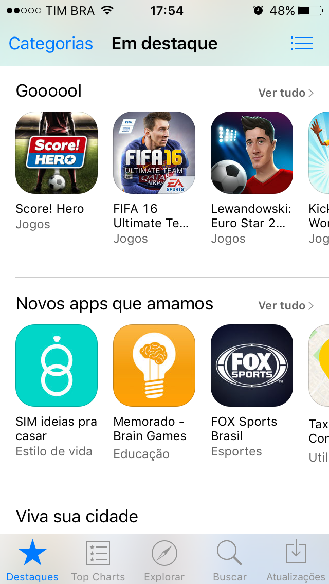
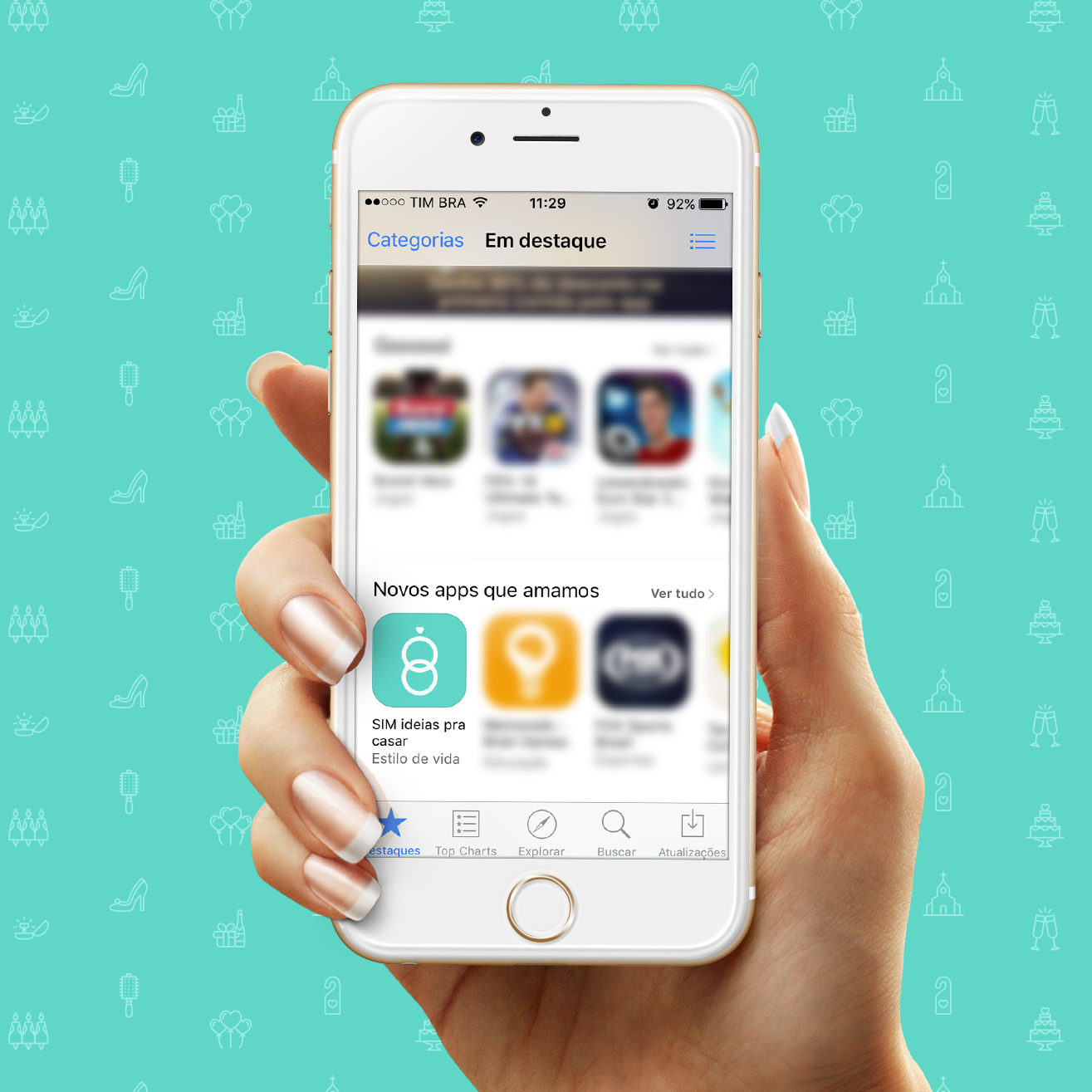
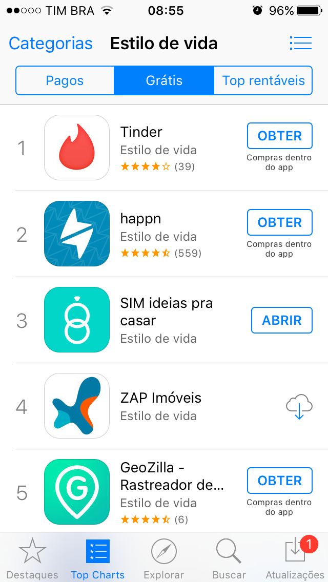
launch reaction
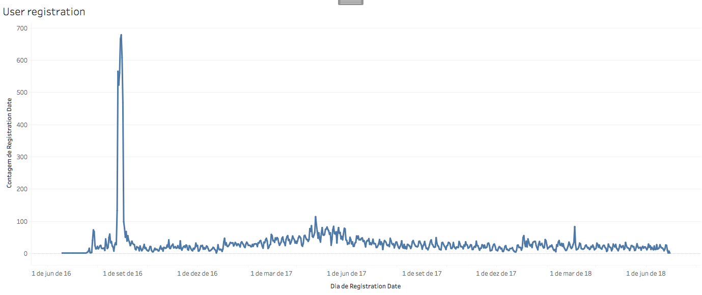
in the second month after the product launch we surprisingly got chosen to the new apps that we love gallery, in the apple appstore. this was a really big boost in the user acquisition of the product, getting to 10000 users in the first semester of operations.
in the second month after the product launch we surprisingly got chosen to the new apps that we love gallery, in the apple appstore. this was a really big boost in the user acquisition of the product, getting to 10000 users in the first semester of operations.
numbers and historic of the product
project conclusions
to this day, this project was when i learned the most about modern digital product design, as i had the chance to be leading the design in several fronts and trough a lot of different challenges, since the design of the mobile products for two operating systems, to direct communication with the development team, usability tests, development roadmap, marketing funnel, launch and sales strategies.
the operation phase was really insightful as well, as user data came on hand, me and the team try to deliver the changes in the product, as well as in the business model, to fit the needs and demands of the users and partners using the product.
when i look through the business model viewpoint, i'm sure that, today, i would make some different decisions. but, if i could look at the product exclusively, i'm really proud of the work that was done, the quality of the experience that was delivered to the users and the perfectionism in all the product details that we maintained. having the experience i have today, it even looks a bit quixotic, but surely a good run!